











Google has begun rolling out a redesigned version of its Gemini app for iOS, introducing a refreshed interface and new ways for users to interact with its AI features.
Early glimpses of the update have surfaced through users on Reddit, highlighting a more modern, streamlined experience.
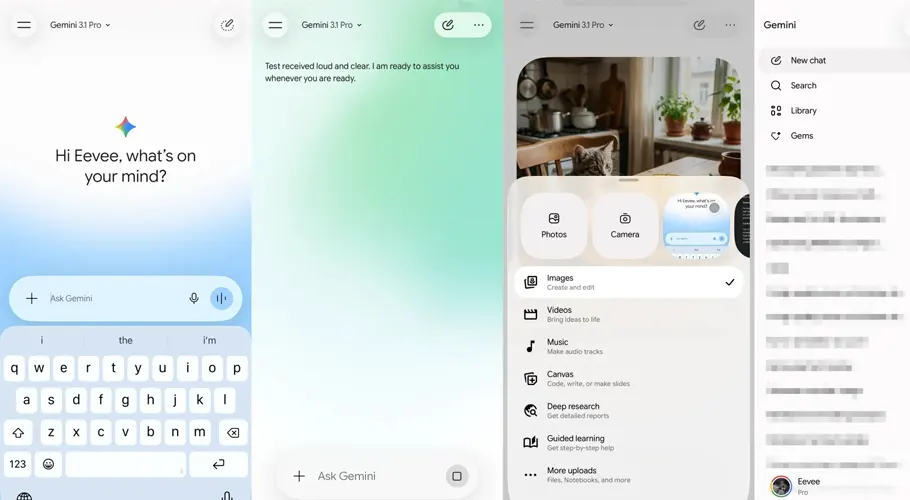
The most noticeable change appears on the start screen, which now features an animated background with a subtle backdrop behind the search bar.
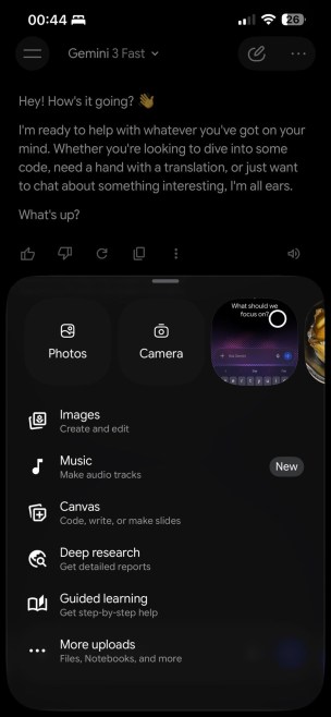
The homepage has been simplified, centering around a pill-shaped prompt box. To the right, users will find quick access to voice input and Gemini Live, while a single “plus” button opens an expanded menu for additional actions.
This new bottom sheet introduces a carousel interface, allowing users to quickly access Photos, launch the Camera, or select recent images.
Other options such as Files, Notebooks, and “More uploads” are neatly organized at the bottom, signaling a stronger focus on content integration.
A key part of the redesign is the introduction of a unified tools list. Features like Images, Videos, Music, Canvas, Deep Research, and Guided Learning are now grouped together with short descriptions, making them easier to discover. This approach has already been tested across Android and desktop web versions, and is currently live on Gemini for Mac.

Navigation has also been refined. The model picker has returned to the top-left corner as a dropdown menu, while the app adopts a new icon style with thin, rounded outlines. Within chats, the “See thinking steps” option has been moved to an overflow menu, with the detailed reasoning now displayed in a bottom sheet for a cleaner conversation view.
The redesign makes heavy use of Apple’s Liquid Glass design language on iOS, expanding on initial support introduced earlier. While the update is currently limited to iOS, it remains unclear how or when these changes will be adapted for Android devices.